How to Improve Power Apps User Experience

When creating any kind of application, not only in Power Platform, but also in other systems, it is important to keep the end-user experience in mind while gathering the requirements, developing the solution, and working with the users to ensure that their needs are met, and the overall experience while using the app is great.
In this article I will note down a couple of low-hanging fruits that you should be aware of, and implement for your next project, to hopefully provide a better experience. Many of the tips here are well known, but these are the things I see our community sometimes forgets about or simply deems unnecessary to invest time into.
Here is a brief overview of the improvements I will be further describing in this post, in no particular order.
| Improvements |
|---|
| 1. Adding icons to the dataverse tables |
| 2. Enable popup experience for lookup fields |
| 3. Quick View Forms |
1. Adding Icons to the Dataverse Table
One simple thing that is often overlooked is adding icons to the Dataverse tables.
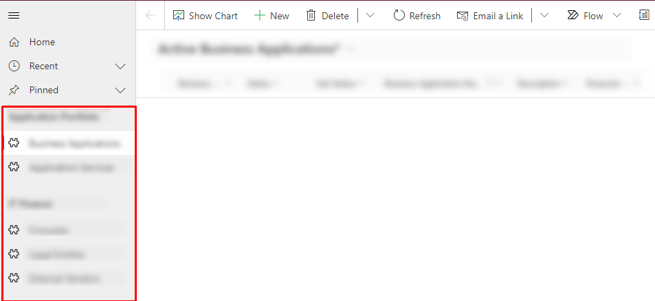
One simple thing that is often overlooked is adding icons to the dataverse tables.
You might ask, why is it important? The icons can be shown both in the navigation menu of a model-driven app and on the lookup fields, and unless you set them yourself, they will revert to the default icon.

As you can see, while functional, the user has to read the text to understand where to navigate and what this lookup field is about. Furthermore, you will only see the icons after collapsing the navigation menu. How to add the icons to the tables?
- Navigate to Power Apps studio, and locate the solution with the table you wish to add the icon to.
- After selecting the table, press "Properties".
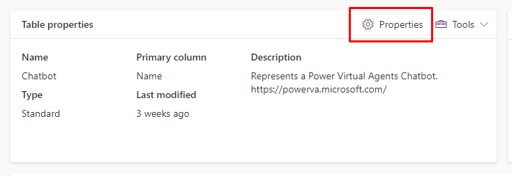
3. A sidebar will pop up, where you will be able to select "Advanced options" and then head over to "Choose table image". You can select an existing icon or upload your own SVG file there. Now, the lookup fields will contain the new icon. You might need to update the icon through the app designer for model-driven apps if it does not happen for you automatically.

2. Enable popup experience for lookup fields.
Main form dialogs for lookup fields provide an improved user experience as users no longer need to navigate to another form to get the details and then return to the main form to select a value. This saves time and effort, and enables users to stay focused on the task at hand. Additionally, they provide more information at a glance, which can be helpful when making decisions.
To enable this, all you will need to do is:
- Navigate to the main form, in which you have added the lookup field.
- Select the field, and on the right side pane, select the "Use Main Form Dialog for Create" and "Use Main Form Dialog for Edit".
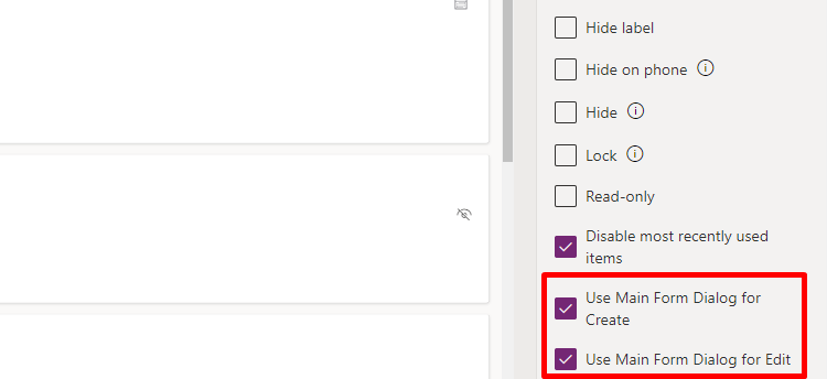
Now, when a user will be in the main form of the application, and want to look up some additional information about the the related record, they will no longer have to leave the context of the form. Instead, a new dialog box will show up, and can be closed any time to return to the main record.
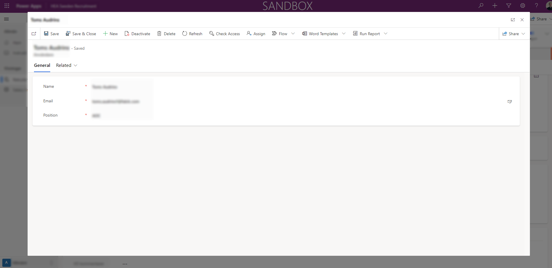
This super simple change has improved the experience more than we would have ever thought. In the feedback we collected after implementing some of the features in our earlier sprints of the Dynamics implementation, main form dialog was the most popular improvement we had done.
3. Quick View Forms
It is important to note, however, that this should not be the only way users can retrieve information of a related record. For example, if the users often need to go to a related record to find some information, you should add a Quick View Form, which allows to display the fields from the related record as read-only.
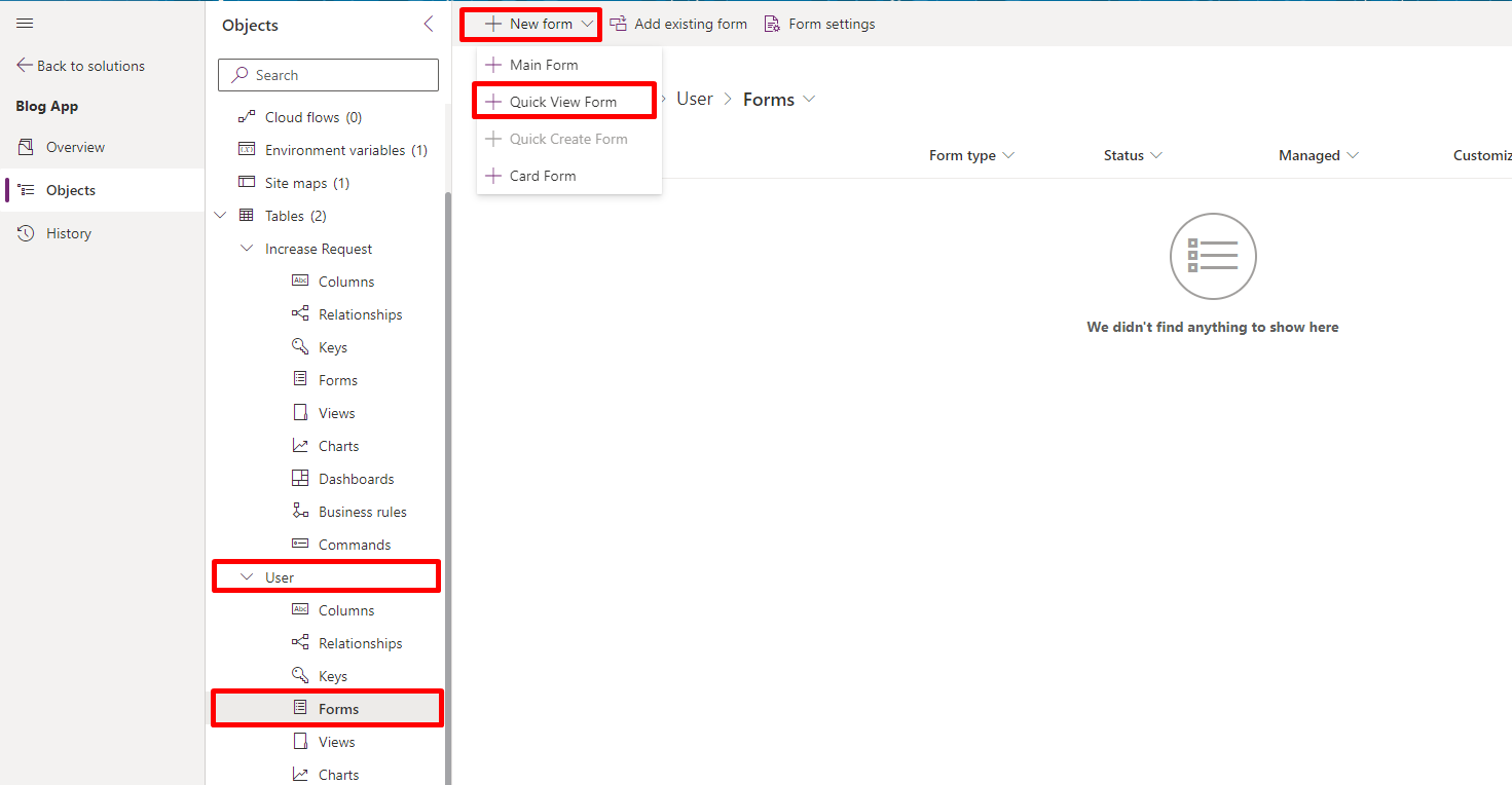
To start off, you will need to create a Quick View Form. This will be done for the table (entity) from which you want to display some of the information on another form.
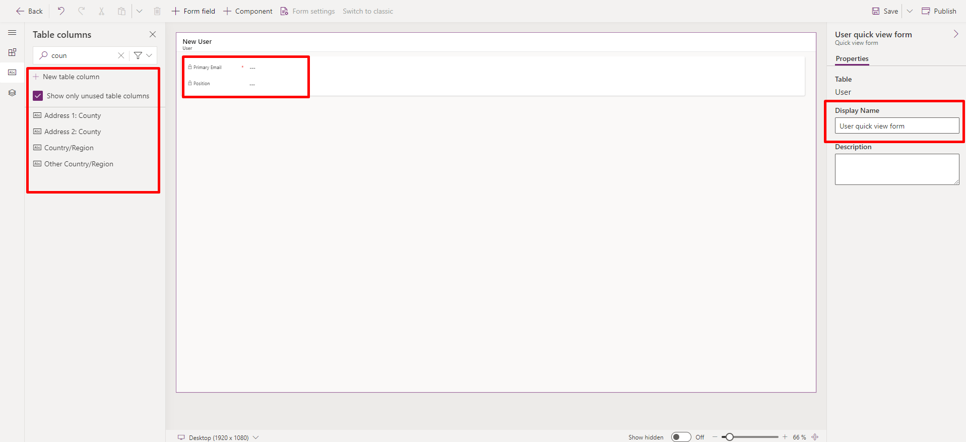
Next, you will need to understand which of the fields you would like to display in another form, provide it a meaningful name (by default it will be set as name of the entity + "quick view form". It is also important to understand, even if you do not set the fields as read-only, the users will only be able to read the data, not make any changes to it by default.
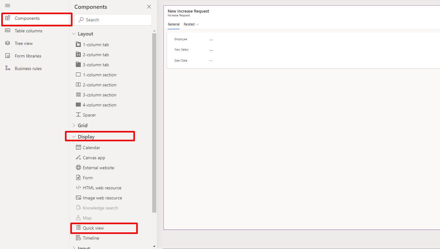
That is it! All that we need to do is to go to the main form, where you would like to display the information. Here, select the Quick View component under "Components" -> "Display".
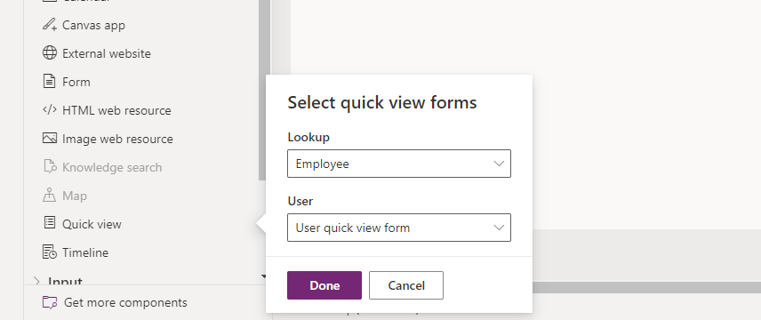
To add it to the form, you will also have to specify the lookup field from which you would like to display details (in my case, the field is called "Employee", you will have another field"), and the Quick view form.
That is it! Now you can go to the form, create a new record, and make sure that the fields that you have selected show up, after you have selected the record in the lookup field.


I hope these super simple tips and tricks help you get the most out of Microsoft Power Platform and improve your end user experience. Let us know in case I have missed something, and I will be happy to add it here. And, as always, keep learning!
Comments ()